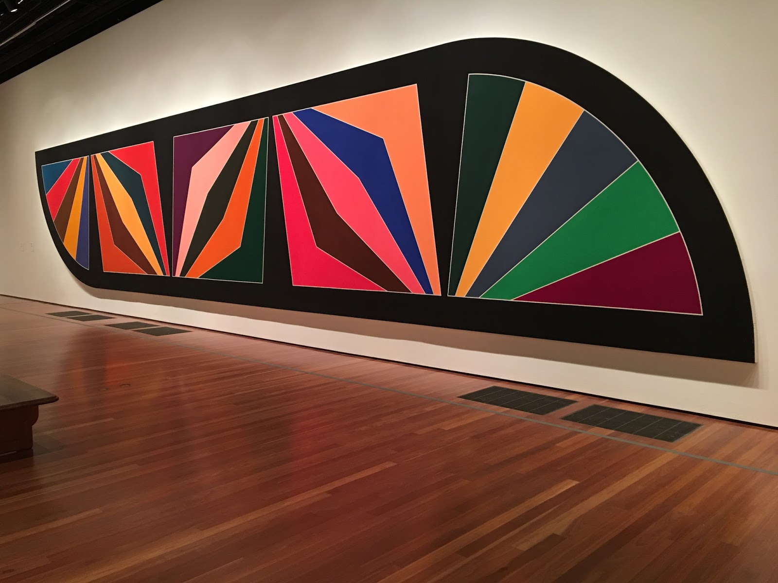
The school environment is a clear example of how color shapes human experience and behavior. Unfortunately, many public school color choices are relegated to administrative and maintenance staff. Classroom colors are often chosen based on ease of cleaning and cost cutting, so dull, institutional colors like grey and beige prevail.
But thoughtful color choice in school environments is crucial to student engagement. Several significant studies show that children behave and perform better in spaces where color is carefully considered. Dr. Harry Wohlfarth performed a study in the early 1980s among schools where institutional colors prevailed. Students were “least stressed” in the school where drab walls were replaced with warm yellow and light blue and full spectrum lighting was added. The students also showed reduced aggression and higher I.Q. test scores. Other studies have shown that school color choices can have an important impact on issues like attention span and absenteeism.
 |
|
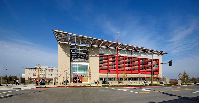
The
entrance to De Anza High School in El Sobrante, California. DLM
Architects photo by Tim Maloney
|
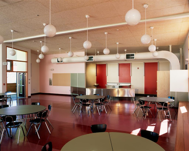
De Anza High, a public school in El Sobrante, California is a case in point. Built in 1955, the facility was long considered inadequate and had a reputation as a troubled school. Test scores and enrollment had sunk to new lows when the district broke ground on a new building in 2010 designed by the San Francisco office of DLM Architecture. Colour Studio was hired to develop both the interior and exterior color palette. “Color is relatively inexpensive way to bring energy and dynamism to a school,” says Colour Studio principal Jill Pilaroscia. For De Anza, lively shades were chosen for active spaces like the entry, corridors, gymnasium, and cafeteria/multi-purpose room. Quieter hues were employed to encourage focus in classrooms. To bring balanced energy into the auditorium of warm and cool hues, Colour Studio used warm woods, theatrical red velvet curtains, cool temperature paint and upholstery colors in deep blues.
 |
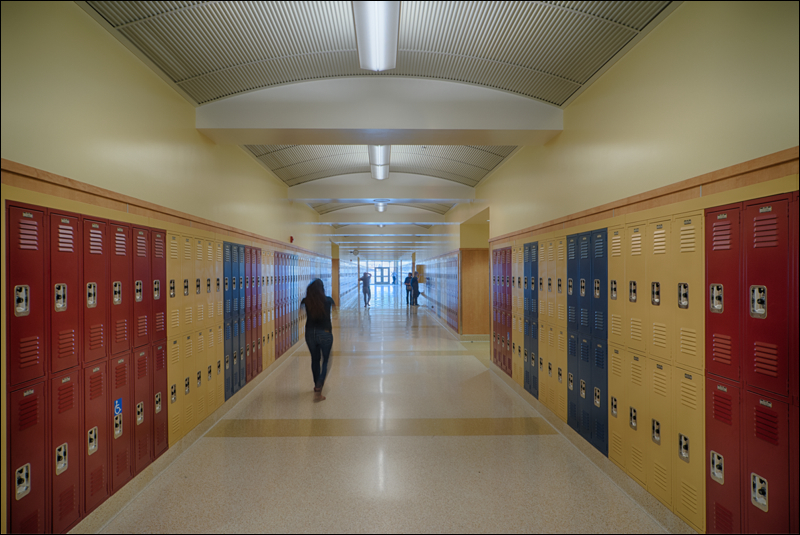
Active
colors are used in heavy trafficked areas at De Anza High School. DLM
Architects photo by Tim Maloney
|
|
 |
| The gymnasium at De Anza High School. DLM Architects photo by Tim Maloney |
 |
| The auditorium at De Anza High School. DLM Architects photo by Tim Maloney
|
The results of the new design and dynamic color program have been impressive. Enrollment grew significantly after the building opened in 2013, and grades have improved appreciably. The principal has also reported improvement in attitude.
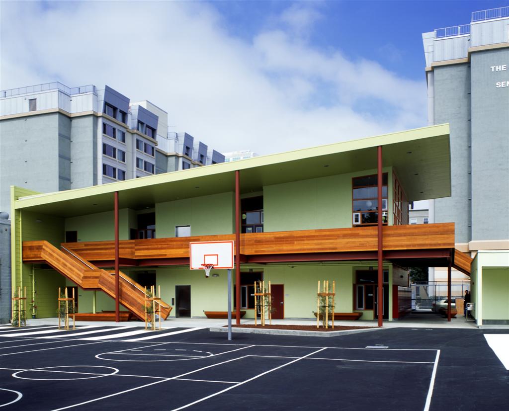
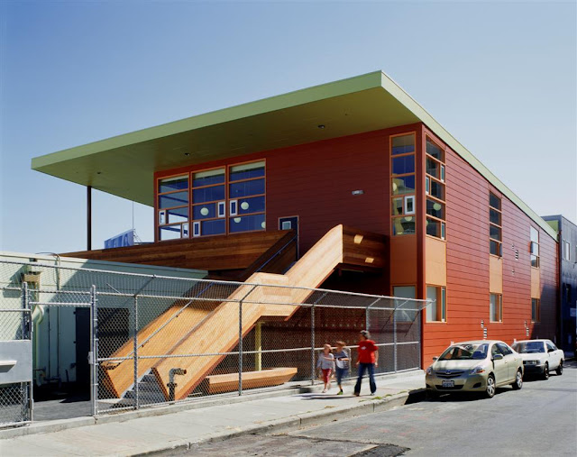
For the Filipino Education Center, a public school in San Francisco, Roberta Wahl of PLUM Architects used color and thoughtful landscaping to energize the design. An urban school site for more than a century, this former preschool was converted into a middle school for 230 students in response to community outreach and feedback. A small footprint maximizes open space, which in turn is utilized for play yards and open garden seating.
 |
The Filipino Education Center designed by PLUM Architects. Photo by JD Peterson
|
|
 |
The
Filipino Education Center designed by PLUM Architects. Photo
by JD Peterson
|
|
 |
| The cafeteria at the Filipino Education Center designed by PLUM Architects. Photo by JD Peterson |
Because the redesign relied on public funds, Wahl explains, “It is our challenge to find an architecture that is delightful while meeting the limited budget given to us. We take this on with pleasure.”
Color can energize a built environment in a highly cost-efficient manner. Wahl envisioned the building as a "little red schoolhouse," she says. At the same time, “There was a lack of green in the area so that was added to give vibrancy and a sense of urban “greenery.” Additionally, striking redwood staircases and lounging benches provide warmth and dynamism to the campus. “I wanted something ‘precious’ for the kids, something beautiful that they would typically not be given because people had little trust in them. This is where the wood came in. They loved it and after nearly ten years, it’s yet to be marred.” PLUM was awarded a Coalition for Adequate School Housing Award of Merit in 2009 for the project.
 |
Nueva
School in San Mateo, CA was designed by LMS Architects. Photo by Kyle Jeffers
|
|
Color is also an integral element at Nueva School in San Mateo, California, a private school designed by Leddy Maytum Stacy Architects in San Francisco. The firm used a Le Corbusier-inspired color palette of primary hues to add a playful, dynamic appeal to the building. Punches of bold color on the mostly warm gray exterior help bring distinct design elements into focus.
 |
| The Nueva School designed by LMS. Photo by Kyle Jeffers |
 |
| The gymnasium at Nueva School. Photo by Kyle Jeffers |
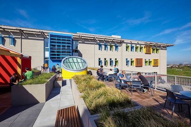 |
Outdoor
space at Nueva School. Photo by Tim Griffith
|
The firm also employed strong color pops to connect the building to the outdoors, where generous public spaces are highlighted by splashes of blue, yellow, and red. For the interior, LMS maximized daylight with white surfaces that reflect sunlight to create a luminous environment. The school provides a variety of innovative educational environments - from flexible classrooms and outdoor seminar spaces to science laboratories and tech shops - designed to inspire the 21st-century student and offer a replicable new model for all schools.
As the stellar examples above show, there is no one formula for using color in an educational setting. However, a number of factors must be considered, Pilaroscia explains. A cross-disciplinary approach – one that considers grade level, demographics, culture and geography, biological and psychological responses – is the best way to bring color into our school's classrooms and corridors.